5 Rebranding Fails from Brands We Love
August 1, 2019
When done right, rebranding gives you an edge over your stagnant competition. It can successfully uplift your business and transform it for the better. However, this is easier said than done. If it were easy to rebrand, then everyone would do it. Good rebranding requires balance. The last thing you want to do is alienate your audience or lose your positive reputation. Learn from these brand’s mistakes by avoiding these rebranding fails.
Rebranding Fails
A rebranding “fail” can be quite difficult to define. For this article, we define this as rebranding decisions that directly led to a drop-in sale, received massive consumer backlash and/or aesthetically displeasing designs.
Tropicana: Too Much Change

One of the most famous rebranding fails came from Tropicana in January 2009. Tropicana wanted to emphasize the juice in their product instead of the fruit itself. After investing $35 million in marketing and packaging campaigns, what resulted was a completely an unfamiliar packaging that regular consumers couldn’t recognize.
After two months of the new packaging on the shelves: Tropicana’s sales dropped 20%, a loss of $30 million dollars. This loss also led to an increase in sale for Tropicana’s leading competitors. This forced Tropicana to go back to its original packaging and branding less than two months later.
Tropicana failed to account for the role of packaging in purchasing decisions. Their customers had an emotional connection to the original packaging, and in Tropicana’s situation, their audience did not recognize the new packaging and sought after other more familiar-looking brands.
Coke: New is Not Always Better

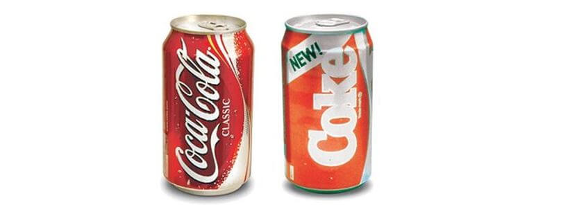
New Coke has seen a massive resurgence in the mainstream due to its quirky appearance in Netflix’s hit show Stranger Things. Its appearance in the show helped remind us of Coke’s rebranding-ish failure. “Rebranding-ish” because of it unclear whether it was a new product or a full rebrand. But for the purpose of this article, we will treat it as a rebrand.
New Coke came out in April 1985 and was a response to Coca-Cola’s declining sales. This rebrand was met with massive consumer backlash and forced Coca-Cola to return to its original Coca-Cola drink. Coca-Cola has introduced a number of different flavours outside its classic flavour. But for some reason, the New Coke line was too far and an unacceptable option for Coca-Cola consumers.
The reason why New Coke didn’t work was that consumers more so saw it as an unwanted change to a classic product instead of an innovative transformation. Overall, it was also too big of a change for its loyal consumers who were the most vocal against this change. The Coca-Cola Atlanta Head Office received 40,000 calls and letters in total, which works out to 1,500 complaints a day regarding the New Coke and the disappearance of the classic Coca-Cola.
NBC: Understanding Your Own Brand

In February 2011 NBCUniversal unveiled their new logo as part of a rebrand after being bought out by Comcast. The logo change debuted a variety of questionable changes from the original logo. First the change in name from “NBC Universal” to “NBCUniversal”, then opting with a serif font against a simple purple background. The result was a visually boring logo.
Experts are baffled by the choices made in regard to this rebrand, especially the choice to remove the super recognizable rainbow peacock. The rainbow peacock is one of the most recognizable logos and NBCUniversal shows a lack of understanding of their brand. I guess the best thing about this logo is that it is completely forgettable and plain. It doesn’t so much as hurt the brand because people still picture the rainbow peacock in their minds regardless of their new logo.
Dr. Pepper: Tone-Deaf

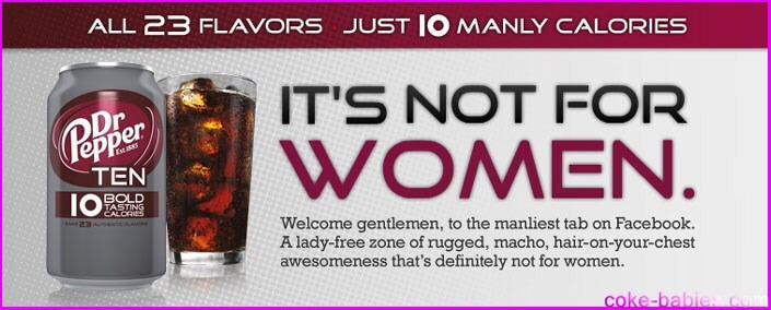
Dr. Pepper looked at the statistics for diet cola drinks and noticed that men don’t really buy “diet” drinks. In an attempt to capitalize this untapped market for diet drinks, Dr. Pepper unveiled an overtly masculine ad campaign that completely missed the mark. Dr. Pepper’s “Not for Women” campaign for its Dr. Pepper Ten diet drink was an ad so stereotypically masculine, that at first glance, was taking as an ill-advised parody sketch of toxic masculinity, something that you’d find on Saturday Night Live.
This October 2018 campaign has been called sexist and tone-deaf. There have been other diet cola drinks successfully marketed towards men (i.e., Coke Zero and Pepsi Max), so how this campaign continued passed the drawing board outstands most experts today. It received massive backlash. Ellen DeGeneres spoke out against it, there were anti-Dr. Pepper social media pages and received plenty of tons of negative media attention.
Gap: Major Regret

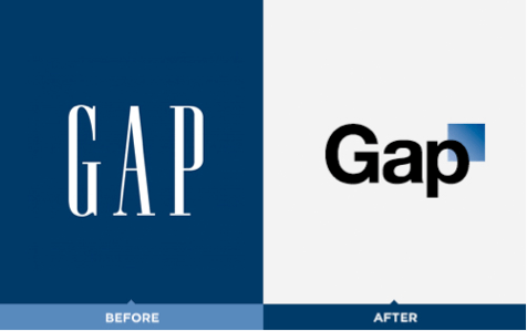
October 2010, Gap unveiled what is now considered one of the worst logo redesigns of all time. In fact, they received such a backlash that it forced Gap to go back to their old logo in 6 days! Graphic design and marketing experts have continually bashed the logo and its properties since it was released.
When redesigning logos, it is important to keep the important and recognizable aspects of the logo. However, the changes made for the new logo was a complete departure from the recognizable old logo and had more similarities to corporate accounting firms than other retail brands.
Gap’s rebrand is a good example of a bad example of what to not do when you want to rebrand. Gap lost focus of its brand identity and the brand launch was not communicated well to its audience. No matter how big and recognizable the brand, how you execute your rebranding is crucial.
Key Learnings
Rebranding is not an exact science and as these companies have shown, can be very difficult to execute. As our list has shown, rebranding fails can lead to expensive costs and damaged reputations. The key learnings from these examples are to understand your brand and understand your audience. All these examples showcased how important it is to celebrate what makes your brand good and to avoid alienating your audience.
 Talk to a person