How Much Did Some Famous Logos Cost?
December 29, 2014
Who can put a price on the value of a logo? It’s hard, but judging by the reaction of the internet when any major company changes its logo some have very high value indeed. Remember Gap in 2010?
Gap

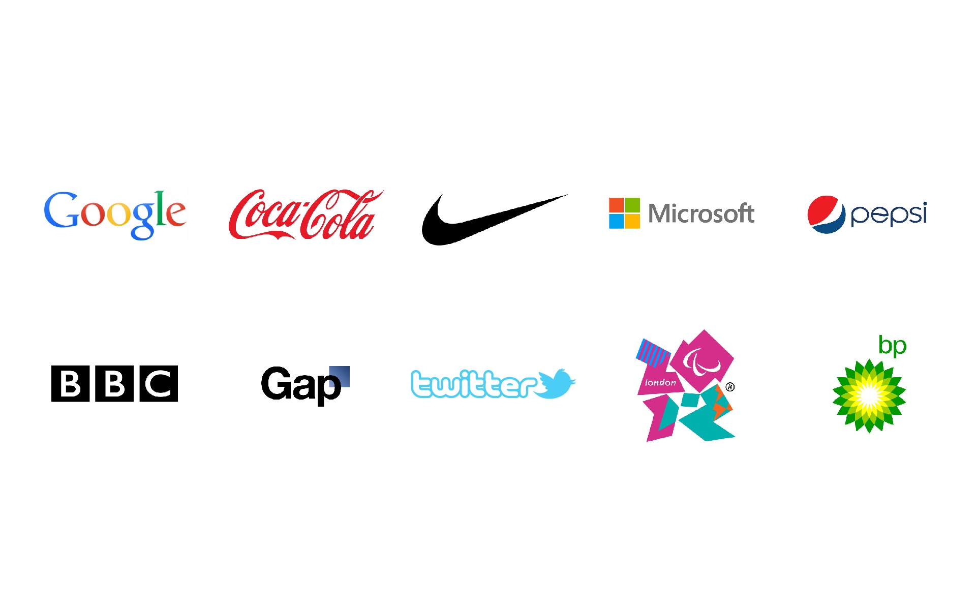
When Gap launched its new logo during the Christmas period in 2010 it was immediately pounced on by social media and torn to shreds. Parodies sprang up by the hour and within a week the new logo was removed and the old one reinstated. Was it just the power of the people adverse to change? The power of the brand? Or just the value of the new logo? Either way, it was a massive marketing failure and at the reported cost of $100 million, not the price tag you’d expect from something that looked like it was cobbled together by the intern with an old version of WordArt.
So how much does it cost to create an icon? Can it be done for free? With that question in mind, and to drown out the disturbing images from Gap’s epic marketing fail, we set out to find out if logo icons could be made for free, and what value companies put on their brand signature.
Pepsi

The Pepsi brand has been through multiple redesigns during its life time and in 2008 the current logo was created. Pepsi is no stranger to controversy and, like a younger sibling struggling to receive attention, can never quite keep up with their biggest brand competitor so attempted to push ahead with a complete brand redesign. Was it successful? Not if you listen to The Forbes magazine:
“The white stripe on the new logo varies across Pepsi products, getting wider or thinner depending on product. The design team that spearheaded the campaign explains that they’re supposed to be “smiles,” but we don’t really see it.”
Neither do we. The cost? Get ready for this … The complete branding cost a whopping $1.2 billion, equal to the gross national debt of several small countries, with the logo attributing to a cool $1,000,000 of it. When you see them side by side the new logo looks disturbingly like the intern with the out dated copy of word art has been at it again – we can hardly tell the two apart.
Coca Cola

You may be wondering why there is no ‘before’ and ‘after’ images of the Coca Cola logo. There is a very simple reason for that – it has never been redesigned. Frank Mason Robinson, who designed the logo in 1885, was John Pemberton’s book keeper. The font is called Spenserian and was the most popular form of handwriting in the mid-19th century. Robinson simply wrote it out in his best handwriting and a brand was born. Cost – $0.
Microsoft

As Microsoft has begun to diversify its products and services it was decided that a new logo had to be designed that more eloquently described the brand. Elements of Bing, X-box, Windows and Office are all represented in the new logo and do provide strong brand conformity. Is it just me, or does it seem to ooze the ‘Blah’ factor and becomes another in the long line of logos that the intern with the original version of WordArt could have written? The least they could have done was given her a recent copy …
The cost of this logo was such a long, drawn out process that a figure has not been released. But the sum is considered to be ‘considerable’.
Nike

The Nike swoosh was designed in 1975 by Carolyn Davidson. Distinct and expressive it has never been altered, adjusted or changed and is recognized the world over. The cost of this logo was $35, but later the company recognised its simple brilliance and value and went back and gave Davidson shares, now worth $600,000.
BBC

This one leaves me speechless. World renowned for everything solid, trustworthy and credible, the BBC decided they needed a ‘more modern image’ and the new logo was born. Why does it leave me speechless? To me the company image is not expressed in the new logo nor does it have a modern ‘vibe’ about it. I can just imagine the faces of the people at the unveiling ceremony at the BBC’s HQ in Portland Place in London, especially those standing at the back of the room. The amazing fact that leaves me speechless… the redesign cost $1,800,000. That was a huge amount of money in 1997. And unbelievable, as if I take my glasses off – I can’t tell the difference between either of them.
BP
When you place the two logo’s together you can see why it needed to be redesigned in 2008. The new logo was a large depart from the trusted BP shield, but worked well, giving the brand a fresh look without losing the credibility. The price they paid, however, for this fresh face was a very hefty $211,000,000.
Google

One of the most recognizable logos in the world, Google’s simple brand was created by one of it’s founders, Sergy Brin, in Gimp. Though it is changed daily, the integrity of the design has been kept intact and cost the company $0, nothing at all.
Twitter

Twitter joins the ranks of Nike, Coca Cola and Google in logo design. They have kept the brand almost identical to the original design and with kept the integrity of their identity. It was designed by Simon Oxley in 2009 and cost the princely sum of $15
London 2012

No look at logo designs would be complete without a look at the controversial creation for the London 2012 Olympics. Not only was the epic cost of $625,000 a point of vigorous discussion, but the design itself was led to huge, heated debates over what it was and what it represented. Even worse, more was handed to have the logo ‘developed’ for the Paralympic games. It only leaves me to think that that intern with the old copy of WordArt missed out on a job, she would have produced something far more understandable.
With the price of these examples ranging from zero to $211,000,000, it would seem cost is not a guarantee of popularity or success. Creating a logo is only a visual clue to the identity of a company, but the development of a brand would appear to be far more important to marketing. Yes, a logo is a key to brand recognition, but maybe money is better spent in being true to the design and developing a trustworthy company ethos that backs up the design of the logo. After all, the Coca Cola logo was designed by an ‘intern’ with a very, very early copy of ‘WordArt’.
 Talk to a person


