Brands with Outstanding Logos | Calgary Graphic Design
June 17, 2019
What’s in a logo? A logo is an anchor to a company’s visual language and brand. It’s more than just a simple stamp for consumers to acknowledge. Logo’s are the face of everything your brand embodies. It is an extension of your
brand’s personality, its identity and its purpose. So, what makes outstanding logos?
The best logos are the ones the communicate these aspects the best in an innovative, memorable and aesthetically pleasing way. These logos can be timeless or dynamic. They can be complex or simple. They are ugly and beautiful. Logos are art and deserved to be studied and appreciated as such.
Here are 11 outstanding logos that represent the best of the best of logo design and redesign.
Design Excellence
First in this list are logos that are just aesthetically pleasing, recognizable and famous. These are widely acclaimed logos that truly exemplifies thoughtful logo design.
Apple
First to kick off this list is one of the most recognizable logos in the world, from one of the most valuable brands in the world-Apple. No other logo has had so much myth around it as this one has.
The story of the creation of the Apple logo has now become this urban legend filled with hidden meaning and mystique. Many were disappointed in the lack of depth behind the creation of the logo. But its actual story is beautiful and most fitting for Apple. Jobs and Janoff designed based on simplicity and intuition, and this is what makes the logo so amazing. It is everything that Apple products strive to and it is clearly represented in the logo and its creation. Elegant, simple, intuitive and approachable.
Uber

Just 2 years after their first major rebrand, Uber committed to another major makeover following controversy with their former CEO and issues regarding the safety of their product. The most recent rebranding became the breath of fresh air they needed. The new logo plays on the strength of Uber’s name recognition and places all the emphasis on that. Like Google, Uber’s name is synonymous with the experience of ride sharing. When you want to get to a bar, you “Uber” there. Even when you use Uber’s competitor Lyft, you still say “lets Uber there”. The old “circuit-board” logo is too abstract and did not make sense.
Abstract Symbol
This category is for brands that have logos that do not or cannot directly reflect the company’s product or services. These shapes and images are meant to represent abstractly what the brand wants to communicate.
Chase
The Chase logo is a famous example of an abstract logo . So influential in fact, companies like McDonald’s Spotify, and Apple have followed suit.
The blue octagon has remained consistent since its inception 50 years ago. It represents in an abstract manner, water pipes that that were laid by the Manhattan company in the 1800s. Chase wanted an abstract logo that is universal, reflecting the global expansion of the company in 1959. The original had unreadable English script, not suited for the global brand that Chases wanted to become.
The current logo does not rely on language but relies on its colour and shape. The octagon is strong and firm, the way banks should be, and the blue represents community and trust.
Adidas

Adidas essentially has three logos in their branding. The three stripes, the Three Bars and The Trefoil. The reason why Adidas’ logo is so effective is its ownership of the three lines. Anyone who sees the three stripes knows that that is Adidas. The three stripes can be added seamlessly to any design, and it instantly becomes part of Adidas and its brand. The Adidas has had that logo since its inception and has changed very little since. Its ability to transform to whatever context its placed in is what makes this logo so great. Not only is it a logo, but it is also a fashion design, a watermark, abstract mountains, or what have you.
Nike
The Nike “Swoosh” logo. The famous logo inspires speed, quickness and movement. Designed for $35 by Carolyn Davidson, a personal friend of Nike’s Founder Phil Knight, this logo has become one of the most widespread and recognizable logos ever.
The “Swoosh is Phil Knight’s own version of Adidas’ stripes. He initially did not like the logo but went through with Davidson’s design anyway. The “Swoosh” ended up being the perfect logo for Nike. It represents the lifestyle athletes want to achieve. The “Swoosh” is abstract wings, stylized as a checkmark for “correct”. Speed, movement and success.
Ugly but Good
What looks good and what looks bad, at the end of the day is usually subjective. This category is for the best of the “ugly” logos. These brands go against the grain and that makes them unique. The success is not despite the fact that they broke the norms, but because they break them.
Google
It’s hard for consumers to admit, especially because of its success, but Google’s famous logo is actually not very good. It goes against classic logo design best practices for the modern world. The original used a serif font, the colours clash and there’s a backdrop shadow. But this shows Google’s commitment to breaking the rules. Their logo has gone through very little changes and Google remains one of the top 3 tech companies in the world.
However, Google’s excellent branding through their whole suite wonderfully communicates what each product does while maintaining the Google aesthetic.
Spotify

The Spotify logo is perfectly imperfect. This logo is famous for its crooked, slightly off-centred logo that drives people crazy and this is exactly what makes this logo so great. If you look closely the logo is a tilted off-center Wi-Fi looking symbol. Which took social media by storm as soon as consumers noticed it.
However, this logo helped rebrand Spotify from this tech-company to an entertainment company tailored for millennials. The logo is optimally designed for cellphone displays, where the logo is visible and unique enough to stand out amongst the various apps present on your phone.
Historic Reference
This is for logos that cleverly reference historic events. Logos are at their best when they tell genuine stories, and what better way to portray that than by creatively incorporating real historical events within the logo and the branding.
Museum of London

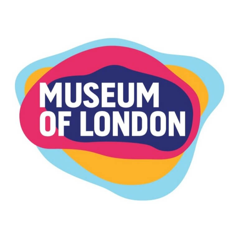
Museums are places that let audiences’ experience the past and how times have changed in a highly informative and curated manner, and the Museum of London’s logo is an incredibly clever and vibrant logo that represents all a museum is and can be in a simple manner.
The various shapes and colours of the logo morphing and shaping actually represent the different borders the city of London has had over its history. It demonstrates that history is not words on a page, but an ever-evolving organism. The logo is an amazing interpretation of the museum’s value proposition, that is to tell the story of London over time.
Jordan

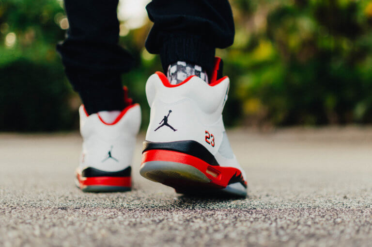
Michael Jordan on top of being one of the greatest athletes of all time has also become a huge corporate success with his Jordan brand. Everyone wants to be like Mike and the shoes, and this logo is a constant reminder of Michael Jordan’s athletic greatness. It makes you believe that shoes will give you those abilities that Michael and become great.
The logo is actually a recreation of a photoshoot Jordan did for a LIFE magazine, where he was originally wearing New Balance shoes.
Visual Puns
Puns, you either love them or hate them. If you look closely, you can that these logos are saying something more than the obvious. They have hidden meanings the cleverly give you more information about the brand and their services.
Amazon

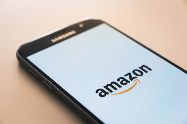
Amazon’s logo is a lot of fun. It is again like the best logos, very simple. But what really makes it, is how incredibly approachable and clever it is.
The arrow is stylized like a welcoming smile, representing their customer centricity, but also it doubles as an arrow that starts from the “a” to the “z” communicating that Amazon sells everything from A to Z.
Tour de France

Tour de France is one of the biggest bicycle racing events in the world. The logo has gone through many logos in its 100+ year history. The old logo was dull and stagnant. The new logo’s font, design and colour are vibrant, energetic and dynamic. It has a very obvious visual pun in the logo. There is an image of a biker riding a bike, with a yellow front wheel, obviously representing the bikers in the race. The yellow circle also represents the summer season for when the race is always held.
 Talk to a person


 The Chase logo is a famous example of an abstract logo . So influential in fact, companies like McDonald’s Spotify, and Apple have followed suit.
The blue octagon has remained consistent since its inception 50 years ago. It represents in an abstract manner, water pipes that that were laid by the Manhattan company in the 1800s. Chase wanted an abstract logo that is universal, reflecting the global expansion of the company in 1959. The original had unreadable English script, not suited for the global brand that Chases wanted to become.

 It’s hard for consumers to admit, especially because of its success, but Google’s famous logo is actually not very good. It goes against classic logo design best practices for the modern world. The original used a serif font, the colours clash and there’s a backdrop shadow. But this shows Google’s commitment to breaking the rules. Their logo has gone through very little changes and Google remains one of the top 3 tech companies in the world.
