Get Your Marketing Mobile – Responsive Web Design
August 18, 2014
Responsive web design has been around for some time and is no longer considered a ‘new’ technology – or even to something to bother writing home about, yet there is still a reluctance among small to medium businesses to build a responsive web site. There are many reasons for this but they all boil down to one thing – the bottom line. It takes time for a web design team to make your site expand and contract as needed to fit on the many different sizes of mobile screens, but keeping one eye on your pocket book and taking the ‘Thanks, but no thanks’, option may be a case of throwing the baby out with the bathwater. If you look at any recent data you can see that mobile devices are fast becoming the first choice viewing option of the majority of people – for any demographic.
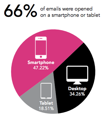
According to a survey by Movable Ink, 66 percent of emails were opened on either a smartphone (47.2 percent) or tablet (18.5 percent) in the first quarter of this year. This continues the trend away from viewing information on a desktop (And that includes laptops), but also continues the increasing dependence on mobile devices from all segments of industry and in all demographics.

It’s not just emails that are being viewed extensively on mobile devices.
In a survey conducted by Nielson, roughly half of the 8,000 people canvassed believed that mobile is the “most important resource” in their purchase decision-making. That statistic may raise your eyebrows, but it’s not the most astounding statistic of the report. It comes second to the revelation that more than a third said they only used mobile exclusively – for everything. This definitely contravenes the current thinking ‘mobiles are so last year’, that Google and others would have us believe. They could not be more wrong.
Mobile usage as the only access to the internet is steadily increasing, as is the shopping pattern of consumers starting their search for an item through their mobile device as opposed to a desk top. 54% of all internet shopping searches start on a mobile device. Previous research suggested that 95% of all purchases start on the internet, so that means only 41% of all internet shopping purchases start on a desk top. If you want to alienate 54% of your buying audience in one sweeping action, not making your site responsive will just about do it. It doesn’t matter how astounding, progressive or downright hair raising your site is, no one wants to squint at a screen trying to read descriptions or prices when they can move on to on that doesn’t take half that effort.
If you are a small to medium business it may seem like a waste of money to make your site responsive, but making that decision right from the start will immediately more than double your sales. With web design it’s always wise to look at your return on investment (ROI) and make a decision on if something is worth it, but making your site, and any new modifications, responsive really is a marketing no brainer.
 Talk to a person


