The Aftermath of ‘Mobilegeddon’
May 12, 2015
On April 21st Google rolled out an algorithm that ranked all mobile friendly websites way above their desk based competitors. An algorithm change is certainly nothing new for Google, but what was unusual is that the change was announced prior to the upgrade, and businesses were given all the tools necessary to remedy the problem before it happened. Was this helpful? Ultimately … we still don’t know.
What this warning from Google did do was set off all emergency beacons in the industry and spread wide discomfort rippling through every web designer’s heart. The problem was that all websites needed to be mobile friendly and the clock was beginning to tick, but in a way that was all that web designers knew. There are levels of mobile compatibility, even using Googles own website checker it gave you one out of three possible rankings. Which one did you aim for?
What is mobile friendly?
Google’s website checker here :
http://bit.ly/1zlJKP1, is very simple to use. You put in your web page url and a result appears. The top accolade is ‘Awesome’, then there is ‘Good’, or the one most people feared, ‘Fail’.
If you don’t speak fluent geek then you may be mystified as to why there are two grades of passes. The reason is your website could be mobile friendly & mobile optimized
or responsive. Mobile friendly and mobile optimized sites get the ‘good’ rating.
Mobile Friendly Website
Mobile friendly refers to a site that displays accurately between your desktop/laptop computer and a mobile device such as a handheld phone (iPhone, Android, Blackberry) or tablets (iPad, Kindle, Galaxy, etc.). While it will appear smaller on a phone and may not work perfectly on a touchscreen tablet, a mobile friendly website will be perfectly functional. Many developers view mobile friendly as a “best practice” for all website developments.
Ensuring your website is mobile friendly is critical. As we discussed above, the percentage of mobile users is quickly rising. What are critical features of a mobile friendly website?
- Text-based phone numbers, physical addresses, or email addresses that can trigger a call, directions, or email message from your mobile device
- Slideshows or image rotators that function without Flash support (Adobe Flash is not supported by Apple and some other mobile devices)
- Small image sizes to allow for fast loading over mobile connections—don’t count on even a 3G connection
Mobile Optimized Website
A mobile optimized site is a far more advanced website. Mobile optimized means that the site will reformat itself for a list of handheld or tablet devices. Larger navigation buttons, reformatted content, and differently optimized images appear when the user is on an iPhone or other device.
Why reformat? Reformatting allows the website to easily engage a large mobile audience when key buying decisions come up. More and more consumers are turning to their mobile devices right in the store. Having a website developed that allows the user to easily navigate and engage from the small screens of their handheld means reaching a decision faster.
What are some good formatting elements that go into a mobile optimized site?
Simplified navigation that is “thumb” friendly with large touchpoints, especially for critical contact information
- Reduced graphics that don’t interrupt the quest for critical information such as product listings or commoditized content
- Avoid making users type unless absolutely necessary
- Give users the option to view the desktop version of your site
Achieving a ‘good’ rating would seem to be good enough to slide into third base, but is it enough? Why not aim for the ‘Awesome’ rating and go the whole hog for a responsive design?
Responsive Design Website

As website design continues to evolve, a fantastic form of development has come into play.
Responsive design is a method of developing a site that is completely flexible regardless of device. Rather than detecting a specific browser type or device type, the website automatically orientates itself based on the screen size of the device. A combination of reformatting and re-optimizing the site as a whole give a practical flexibility beyond imagination.
It sounds like the nirvana of all web design, and it is, but it comes at a price. That’s one of the reasons why so many websites were not ready for mobilegeddon, and probably why Google decided on the new algorithm.
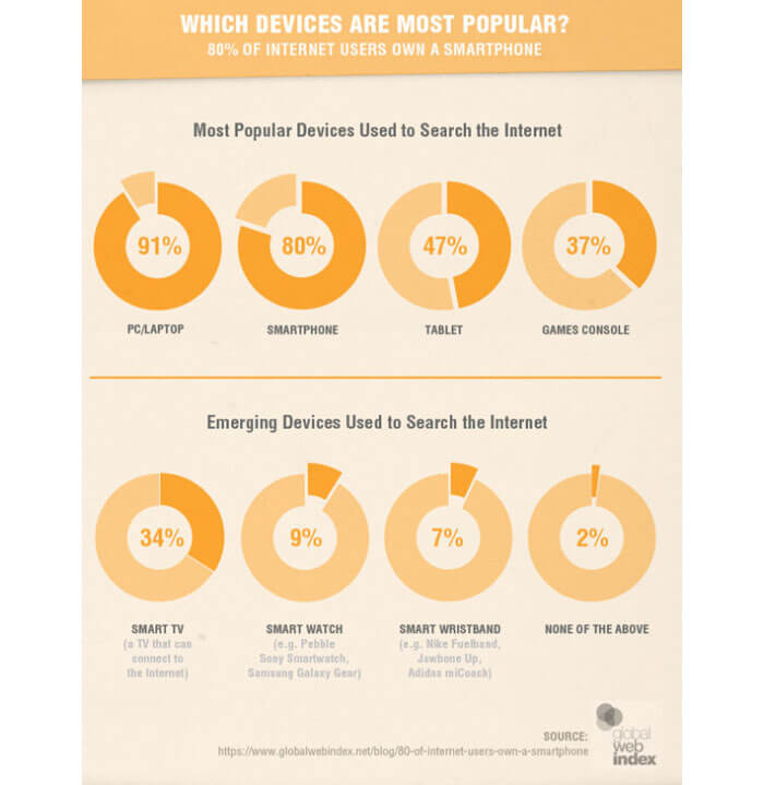
Surfing the web is now dominated by mobile searches. The diagram below shows the data from the first quarter of 2015 on which devices are most popular for searching the internet.
Smartinsights.com gathered the information and said:
“We’ve created a new summary showing the
global popularity of using different digital devices using data from Global Web Index to include in for our State of Digital Marketing 2015 infographic.
It clearly shows the popularity of smartphone ownership and emerging mobile devices like Smartwatches.”
It appears that Google was right in forcing website owners to make their pages mobile enabled, but it does come at a hefty cost to those who struggled to afford it in the first place. And it’s going to use even more time and money to go back to fix it, but they have to. From April 21
st your website has to be mobile enabled or it will be invisible to Google, therefore invisible to your chosen audience.
One detail missed out in all of the ‘ever so’ helpful information from Google was that if the three rankings are displayed in order. Will all the ‘fails’ be at the bottom, under an eclectic mix of ‘Awesome’ and ‘Good’, or will it be a strict ‘Awesome’ websites first, followed by the ‘Good’, then after that a sorry heap of failures? We don’t know, but it would make sense to
rank them in order or why go to the bother to make the three categories?
How do you know if your website is mobile?
If you are not a web developer, how do you know your site is mobile friendly? One of the best ways to find out is to take out your smart phone and google yourself. Then you can use Google’s tool above and be sure.
Another way to see if your site is responsive is to look at your analytics. You should already be very familiar with how they reflect the performance of your website. If you’re dropping like a stone, then it’s likely that you need to rethink your responsive web design. If you’re not, don’t get too smug just yet.
Many people took April 21st as ‘D Day’ and that when the clock ticked over to April 22nd the results were out and you either passed or failed. No, not so. The rollout, like all other algorithm roll outs, was predicted to take a ‘couple of days’, now has been pushed out to a ‘couple of weeks’, which is now, ‘a couple of months’. Even after that it could take some time before your rankings reflect the new position. Or in short, you may be #1 today, but will you be there tomorrow? Who knows?
The good news is that Google reports that if you are affected by mobilegeddon that as soon as you make your site responsive it will be reflected immediately and you will be back to your rightful place. But by looking at the time it’s taken for them to roll out the algorithm we really need to wait and see.
The only conclusion you can really draw from mobilegeddon is that if you own a website, you need to check out your mobile presentation right now. Whether your site is or isn’t mobile optimized, the time to make it so is right now! Hopefully before you lose your rankings.
 Talk to a person


